Park+
A brand identity for everything that comes with owning a car.
Park+ is a mobile-app platform that solves the everyday friction of car ownership, finding and booking parking, buying and topping up FASTags, getting a car wash, paying traffic fines. At GDD, my task was to give Park+ a brand identity that carried its idea clearly and stuck in people's minds.
The Problem
India's parking problem, in two numbers
Before any sketching, the brief started with research into what car ownership actually feels like day to day and the numbers made the pain point concrete.

User expectations
01
Hassle-free parking, start to finish
02
Spaces that feel safe to leave a car in
03
Easy to find and easy to book
04
Pricing that feels fair, not opportunistic
Who it's for
Reading the competitive set
Mapping Park+ against the existing competitive landscape helped pin down who the brand actually needed to speak to: the mass-premium car owner someone used to some polish in the products they choose, but firmly driven by convenience over status. That single insight set the tone for everything that followed: confident, not flashy
Design Process
Finding a mark that moves
The creative brief kept coming back to one line from the client: the logo needed to feel bold, and it needed to express movement and forwardness while staying instantly recognisable at a glance.
Exploration
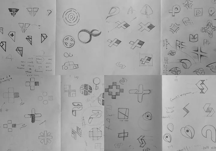
Sketching toward a symbol
Dozens of directions were worked through on paper before any of them touched a screen: crosses, arrows, loops, and abstracted "P" forms testing which ones actually carried a sense of forward motion rather than just looking geometric.
Resolution
The mark that stood out
The winning direction is a combination mark: a curved, elegant symbol paired with a solid, highly readable wordmark. The symbol reads like a "P" caught mid-motion the same swoop a car makes pulling into a spot. A saturated, high-contrast palette was chosen deliberately so the mark holds up equally well printed, embossed, or lit up on a screen.

Identity System
Built to be said, not just seen
Park+ needed a name that reads clean at any size from a business card to a van livery. The wordmark uses a simple, solid, highly legible typeface, deliberately restrained so the symbol keeps doing the talking.
The colour system leans on pure, high-contrast tones that hold up in both digital and analog spaces the same mark needed to feel equally at home on a phone screen and stamped in wax.

In the World
One mark, every surface
A brand only earns its "high recall value" if it survives contact with the real world fleet vehicles, business cards, signage, wearables. The system was stress-tested across all of it before it shipped.

Digital Ecosystem
Carrying the brand online
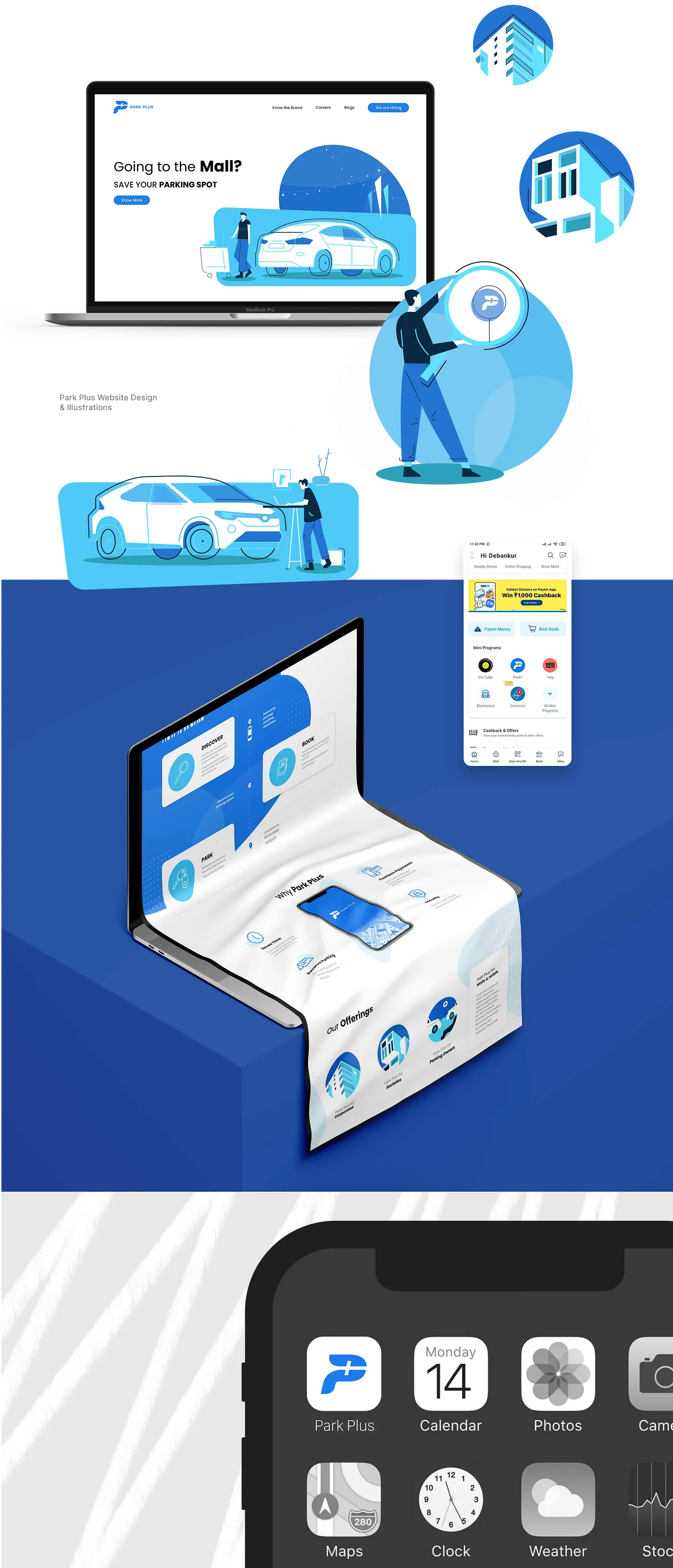
A custom illustration style was developed alongside the mark for social, banners, and marketing and extended into a landing page that gives Park+ a proper web presence: the same brand voice, now doing the job of getting someone to download the app.
Outcome
Live on iOS and Android as Park+
The identity shipped across the Park+ app, website, and offline touchpoints carrying the brand from a sketch of a "P" in motion to the icon people now tap every time they need to park.