Designing to Scale
Re-architecting a mobile-first card experience for the web
Park+ is a mobile-app platform that solves the everyday friction of car ownership, finding and booking parking, buying and topping up FASTags, getting a car wash, paying traffic fines. At GDD, my task was to give Park+ a brand identity that carried its idea clearly and stuck in people's minds.
01 — The shift
More screen doesn't mean more space.
Card Suite was originally designed around a mobile experience. When we extended it to the web, the challenge wasn't simply to make the existing screens responsive.
The Web SDK needed to bring Card Suite capabilities into financial institutions' web applications while maintaining a consistent experience with the existing Card Suite ecosystem. The SOW explicitly defined it as a responsive experience supporting web, mobile and tablet surfaces.
But a larger canvas changes how people expect to navigate.
On mobile, users naturally move through a focused, sequential experience.
On desktop, they expect to:
see more information at once
move between related areas quickly
understand where they are
access secondary actions without repeatedly opening screens
take advantage of persistent navigation and larger content areas

So the question
became
How might we evolve the Card Suite experience for larger surfaces without creating a completely different product?
The problem
We couldn't just make mobile bigger
The initial mental model was straightforward:
Mobile → Responsive Web
But that approach created an important design tension.
The same information had to remain consistent across channels, while the way that information was organised and accessed could change.
The SOW itself reinforces this requirement: a user accessing Card Suite through Web SDK and Experience SDK should see the same cards, controls and alerts across channels.
So we established two things that had to coexist:
Consistency
The underlying Card Suite mental model, terminology and capabilities should remain familiar.
Adaptation
The IA, navigation and interaction patterns should take advantage of each surface.
That distinction became the foundation for the Web SDK.
Understanding the existing experience
Start with what already works.
Before introducing new patterns, we mapped the existing Card Suite experience and identified how its information was structured on mobile.
The existing experience revolves around a relatively focused set of cardholder capabilities:
Cards → Card details → Transactions → Controls → Management
The Web SDK scope included cards, current-month spend, available balance/credit, transaction lists and details, freeze/unfreeze, card controls and card management.
That gave us the foundation.
The challenge was deciding what should remain sequential and what could become persistent once more space was available.
The hard part
More space ≠ more information
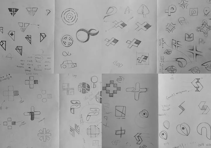
Dozens of directions were worked through on paper before any of them touched a screen: crosses, arrows, loops, and abstracted "P" forms testing which ones actually carried a sense of forward motion rather than just looking geometric.
05 — Re-thinking the IA
From a linear journey to a spatial model
The winning direction is a combination mark: a curved, elegant symbol paired with a solid, highly readable wordmark. The symbol reads like a "P" caught mid-motion the same swoop a car makes pulling into a spot. A saturated, high-contrast palette was chosen deliberately so the mark holds up equally well printed, embossed, or lit up on a screen.

Identity System
Built to be said, not just seen
Park+ needed a name that reads clean at any size from a business card to a van livery. The wordmark uses a simple, solid, highly legible typeface, deliberately restrained so the symbol keeps doing the talking.
The colour system leans on pure, high-contrast tones that hold up in both digital and analog spaces the same mark needed to feel equally at home on a phone screen and stamped in wax.

In the World
One mark, every surface
A brand only earns its "high recall value" if it survives contact with the real world fleet vehicles, business cards, signage, wearables. The system was stress-tested across all of it before it shipped.

Digital Ecosystem
Carrying the brand online
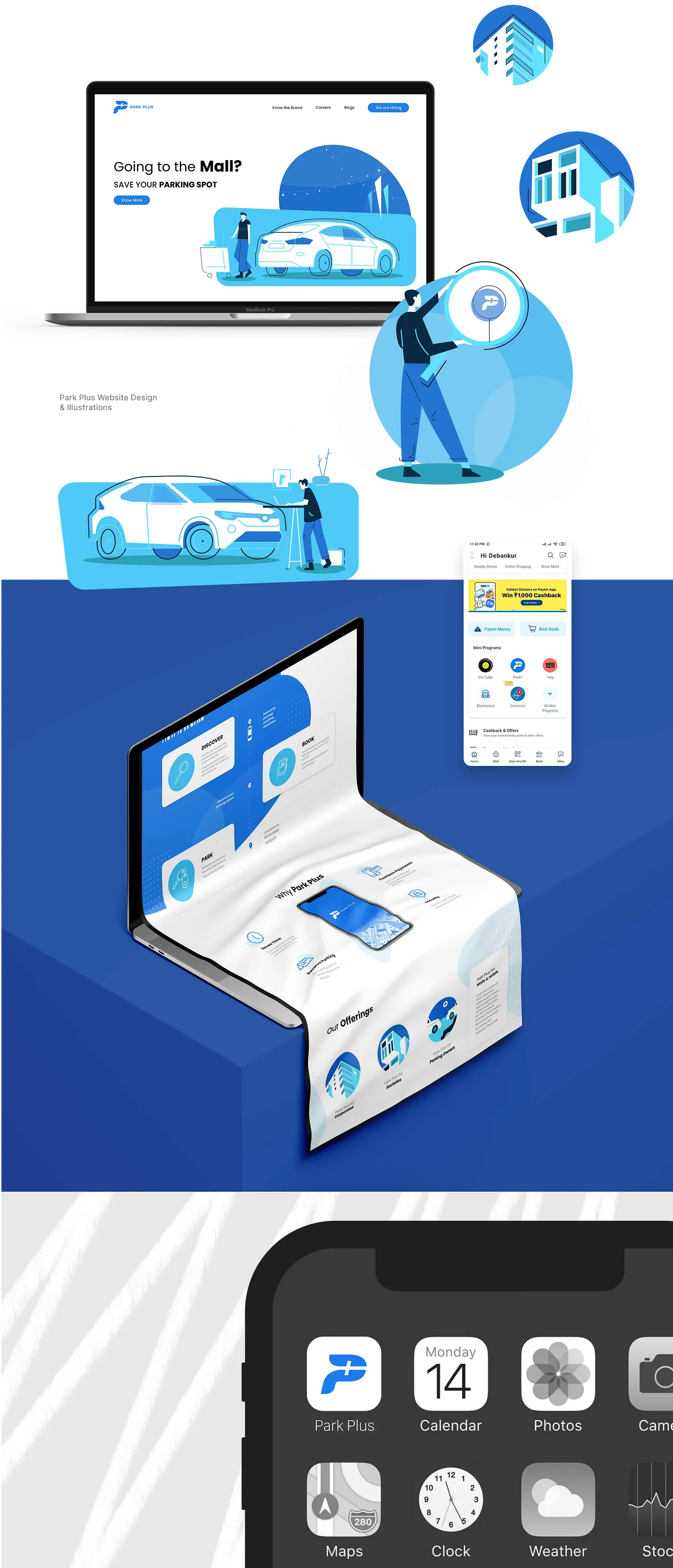
A custom illustration style was developed alongside the mark for social, banners, and marketing and extended into a landing page that gives Park+ a proper web presence: the same brand voice, now doing the job of getting someone to download the app.
Outcome
Live on iOS and Android as Park+
The identity shipped across the Park+ app, website, and offline touchpoints carrying the brand from a sketch of a "P" in motion to the icon people now tap every time they need to park.